In my previous blog post about why a kettle costs so much, the one statement that perhaps riled the most people up is where I said Tesla Model S’ touch screen control panel was a stupid idea. In fact, the link to the Model S control panel is amongst the top most clicked links out. I do think it’s a stupid idea, but I must disclaim that I have never driven a Tesla, so I may be talking out of my ass based purely on logical reasoning and not a practical experience* P/S: Tesla, come to Australia already. .
The logical reasoning goes something like this: I am driving down the road at 110 km/h. My eyes are on the road, as all safe drivers do. The radio station suddenly plays Justin Bieber* I’m only using Justin Bieber as a punching bag because everyone uses him thusly. I actually have no opinions on popular music given that the music I regularly listen to are dated to 300-400 years ago , and the car gets cold suddenly because Bieber is a witch. I want to: a) change the current radio station; b) raise the temperature of the vehicle interior. But first I have to go to the media control app. Then I need to change my media playback from a radio station to a Spotify playlist containing all my favourite Tchaikovskys. Then I need to access the climate control app to raise the temperature by a few Celcius.
The question is this: How many times have I taken my eyes off the road, and how long for each time?
I am aware of the control clusters on the steering wheel, which can apparently access almost any app on the touchscreen panel. Given it was shoved in pretty much as a footnote in the presentation video on the Tesla touch screen control panel, I’m not sure as to how well tuned and how well used that is compared to fiddling around on the touchscreen panel. The above scenario would be invalid if indeed control cluster can be practically used to do all what needs to be done when driving. I’m not sure about what the practical, day-to-day use is yet.
The advent of touchscreens in cars began a long time ago with the BMW iDrive (powered by… Windows), the Tesla merely takes it to the logical conclusion. Rather than bashing Tesla* and really, Tesla is an amazing company which took me out of my complete apathy of automobiles – I actually took an interest in cars because of Tesla, and I really DO want to own one in the future , I’d like to point out a trend I have been noticing lately: the streamlining of things.
The Light Switch
I am currently on holiday in Malaysia (mainly taking a sabbatical for Chinese New Year and to complete writing my book – Underhanded Javascript (or the alternate title: Javascript Technical Interview Questions)). This is the switch for the bathroom lights in my hotel room:
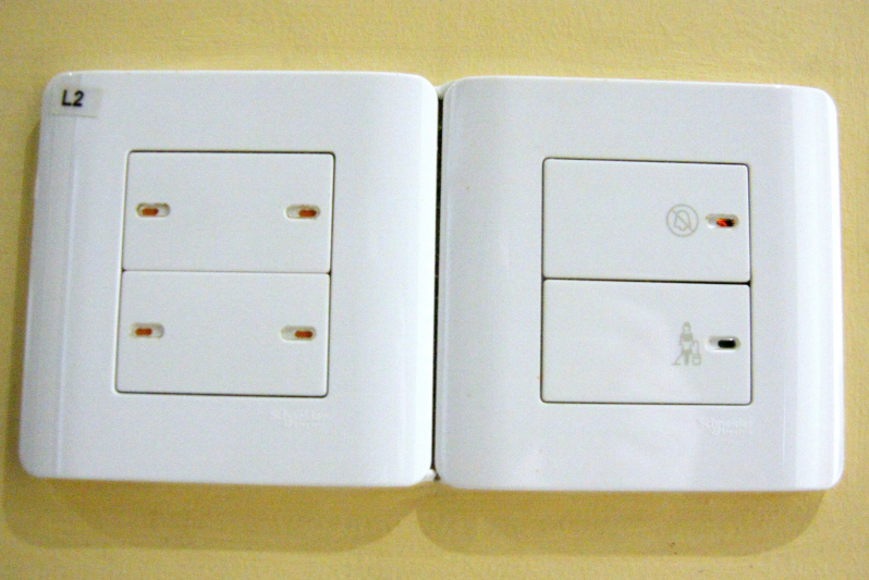
Hotel Bathroom Light Switch
It’s basically a pushbutton switch (rare in Malaysia, given that the majority are rockers) where the surface of the push button is at the same level with the wall plate. When pressed, it depresses, and then comes back up to the same level as the wall plate. If the switch is in the ‘ON’ state, then a red flag will show up in the little window on the button.
See the problem? No? Try again in the dark. Oh. I forgot to mention that two of the switches control the light in the rest of the room. If you press the wrong switch, you turn on the lights, waking everyone else in the room.
It may seem a bit silly to be complaining about stuff like light switches, but it’s the things we take for granted that are often the most important – things like being able to feel a light switch when fumbling about at night. This is doubly so for hotels, where guests are unfamiliar with the buttons.
A basic rocker switch conveys a lot of information by touch, which the switch I have in my hotel room has lost. For one, the state of the switch can immediately be known by touch alone. Many houses have switches that control lights which cannot instantly be known at the time of touching the switch. An example are garage and balcony lights. Bathroom lights too, if the switches are outside the bathroom and the door is closed. By touch alone, a rocker switch is able to inform one as to the state of the switch: is the light on or off?
By comparison, the switch above has a very poor way of informing a user of the state of the switch. Yes, it has a red flag that comes on when it’s on (or off, depending on how you’d wire it I guess). But it’s entirely visual, and too small. When was the last time you looked at a switch to figure out whether the lights in the next room are on or off? Or maybe you’re across the room and you want to make sure that the garage light is turned off before you go to bed – the little red dot wouldn’t be able to provide much information.
Another issue that this light switch had was that in the dark, one would be unable to feel the location of a single switch. Eventually of course I got used to it and had learned it, but this problem wouldn’t have existed if it were a non-flat rocker switch.
At this point, I sound like an old codger going “waaah I don’t like change!!!!”, and I do indeed sound like a pedant unwilling to learn new things. But that’s not all to the story…
Staff Only
Outside in the hotel corridors I noticed the sockets at the bottom of the walls. A curious thing was that the wall sockets were not of the fancy flat button sockets that I had in the room. They were plain, utilitarian rocker switch wall sockets. I figured they were for hotel staff to use – vacuum cleaners and stuff, hence aesthetics were not of prime importance.
I later found a staff-only utility closet and I quickly snapped a picture of the wall switches and sockets:
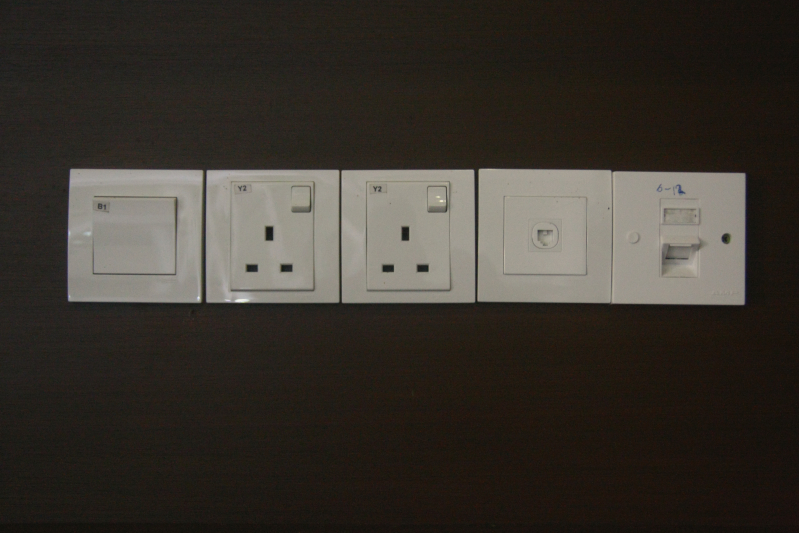
Utility Closet Switches
Entirely utilitarian. The same pattern could be found in areas with high staff traffic (I couldn’t take pictures of many of those areas, unfortunately). In fact, it was quite strange that the staff areas had some switches that are labelled carefully – both with serial numbers and descriptions – and the guest areas don’t have labelled switches.
Upon realizing the difference between staff areas and guest areas, I immediately intuited that aesthetics were the primary reason why the flat panel switches were used only in guest rooms. Of course another reason would be the cost. A quick check at Alibaba told me that on average, the flat panel switches were about $0.50 to $1 dearer than the usual rocker switches. In bulk, that could add up to quite a bit – it would make sense to give the guests something that look nicer, and provide the staff something that is highly functional but does not have that great of an aesthetic appeal.
Streamlined Design
Which brings me to the point of this article: Modern design trends are to streamline more and more things. Mobile phones went from something full of buttons to a flat pane of glass. That’s a good thing – I had a PDA phone long before the iPhone made smartphones popular – however, I do feel that many designers only give aesthetics a thought and not functionality. There seems to be a fetish with making things flat.
I’m not talking about the flat interface designs on computers and smartphones – I wrote Fork the Cookbook, and it has a flat design, but I think flat design there serves the purpose of highlighting the information hierarchy quite well. I also think that the-design-language-formerly-known-as-Metro* I REFUSE to call it Modern. FFS Microsoft, you’re a billion dollar company, get your marketing act together. is superior to iOS7’s meaningless flat design. Instead, I’m talking about the flattening of the interfaces of the world at large. Light switches are not the only things going flat. TV remote controls are going flat too – anyone remembers this absolute shitty Philips Universal Remote Control (the current Phillips Prestigio remote
has reverted back to having many buttons but still weirdly has a screen* It’s also one of those strange things where it’s cheaper in Australia than in US )?.
The problem I think, is when designers put aesthetics in front of usability and functionality. One just has to look at modern day smartphones and ask this question: Why are there physical volume rockers? Everything is controlled by software. It would not be implausible to design an entirely streamlined phone with no physical buttons – the Samsung Galaxy S4 has face unlock and all sort of proximity sensors to turn the screen on and off. You could design a phone that doesn’t need any buttons.
So why are there still volume control and power buttons on a phone?
Clearly it’s because mobile phone designers are not stupid. The volume buttons are one of the most frequently used controls on the phone. To make it soft button only would be a little silly – unless of course, it’s done Android style, where the Home, Back and Switch Apps/Multitask buttons are in fixed positions (depending on the orientation of your phone). But even that causes some UX issues – turning down volume mid-calls is one I can actually think of right off the top of my head* Again, of course there are the “on the other hand…”s, so allow my inner economist to present the alternative: on the other hand, how often do people change their volumes mid-call? This then becomes an issue of statistical design, and it’d be up to the designers to actually study this issue .
On Minimalism
I feel (and I must qualify that this is an entirely subjective thing) that many designers design minimalistic things for minimalism’s sake. A growing aesthetic trend is to hide everything of complexity under something simple. This is what I call the Apple school of design: shove everything that is complex away from the user. This is both good and bad.
I have been using a Linux based computer for a very long time. The UX in Linux, especially in the pre-Ubuntu days, were terrible. Users are expected to customize everything from the kernel to X Server to Gnome* Ubuntu is fantastic nowadays. It just works, but still presents customizability. I’ve not distrohopped for a very long time. Maybe I’m getting old . By comparison, my Macbook “just works”. Until a certain point. Generally stuff involving customizing OS X are difficult. Ever tried to install Cairo on a Mac (no, brew install cairo had a bad copy that didn’t allow me to run R with it properly)? What about Python? I ended up so frustrated I just VirtualBox-ed almost all my dev tools (except Go and Git, both of which run fantastically on a Mac).
Nowadays with software eating the world, it becomes more and more possible to shove heavily complex stuff under simpler interfaces. Earlier in the article I criticized the Model S’ touch screen control panel. It is however, not without virtue. For example, trying to put physical controls on an internet radio station would be nigh impossible. The way the software works for internet radios require quite a bit of visual feedback. The touch screen design also allows for layered control – instead of having multiple groups of physical buttons to change the temperature or lights of the car, one physical interface (i.e the touch screen – it’s essentially one big physical interface) is used instead.
The problem with these kinds of minimalism is that it’s actually deceptively minimal. One physical interface is minimal. But it hides away all the complexity which is in some cases, quite needed. It also leads to poor design of things, for the want of aesthetics. In general this comes with copying what Apple does, and doing it far poorer.
We see the latter example all the time. The Apple chiclet keyboard is one of the worst keyboards I have had the misfortune to use (I’m currently typing this on a mechanical keyboard). It was designed with clean lines in mind, so that the gaps between the keys would give users a sense of space. Too bad it’s really quite a bad typing experience – on a chiclet keyboard my WPM drops to about 65 from 80 on a mechanical. And despite the fact that the chiclet keyboards are actually a much worse typing experience, most laptop manufacturers now implement a chiclet keyboard on their laptops!
Another example of poor design aping Apple is the touchpad and gestures on other laptops. Without a single doubt, hands down, the Macbook’s gesture and touchpad is the best in class. There is really no other phrase than “really well thought out of” to describe it. However, all you gotta do is to try the gestures and touchpads of other laptops, and you realize that they’re just copying Apple for the aesthetics, because again, it’s minimal and pretty.
Making the Visible Invisible, and Vice Versa
The touchpad on an Apple laptop (or the magic trackpad) is an example of a good use of hiding complexity under a minimalistic interface. But really it’s just really well thought out of. Almost every basic use case has been considered – even some corner cases. The touchpad makes sense because it mimics the way we interface with things in real life. It’s almost natural to pinch zoom* Yes, I am aware that there is an element of training involved. . The only alternative before the pinch zoom was to click and drag – which in older PocketPC phones, meant tap and hold and drag. Having almost natural gestures on a touchpad actually removes cognitive load while performing tasks. This is what Don Norman calls “making the visible invisible” – the tool disappears from cognitive load entirely.
In the case of the light switch it’s actually the inverse. By flattening the button, additional cognitive load is added – one for figuring out the state of the switch, and the other for figuring out the location of it. I would wager the same for the Model S.
Conclusion
In Don Norman’s The Design of Everyday Things, a lot is said on the placement of switches. I recall at one point, he wrote something like having wheel-shaped buttons to control the wheel and wing shaped buttons to control the wings in a cockpit of an airplane. I started this article about some design decisions of a car which I personally think are poor, and I’ll end this post with a picture of the seat control module of a Mercedes – the numbered buttons aside, I think it’s quite clear what these buttons do:
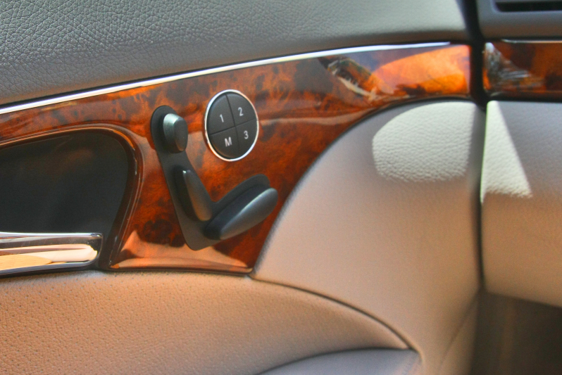
Mercedes Seat Control Module