I’ve been writing code quite a bit lately. I used to be the kind of guy who would work on any IDE with any appearances because they didn’t matter much to me. I would code with the default IDE themes (from Visual Studio to Eclipse to Aptana). But then, something changed. I became the guy who tells everyone: appearance matters (I still have colleagues at work using the default Visual Studio theme)
Colour
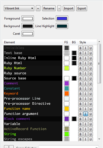
This year, I decided to try something different. I changed my IDE colour scheme to the VibrantInk colour scheme. And suddenly, my productivity increased. I realize, as I grow older my eyes are more sensitive to certain schemes. A white background with black monospaced text made my eyes tired really quickly, and switching to the VibrantInk theme on Eclipse helped a lot. Over the year, I tweaked more and more of the IDE colour schemes of both work and home. Here’s how my home Aptana theme looks like (it’s the Vibrant Ink theme with the background colors switched to #191919)

Vibrant Ink Theme for Aptana
Font
Then came the font revolution. Most IDEs would use the default monospace font on the system (Courier for Windows, Ubuntu Mono for Ubuntu). I was fine with those to begin with. Eventually, tweaking about, I settled for Inconsolata at home and Anonymous Pro at work (I use separate fonts to force my mind to think differently). The same fonts would be set for my terminals at home and at work.
Another tool that I twekaed was PuTTY. But I had just built a new computer last month and my PuTTY is still not tweaked – i.e. still using the defaults. My Aptana on the new machine is fully pimped out, but not my PuTTY – afterall, I don’t pay much attention to it considering I have 4 PuTTY windows sitting there doing nothing, except the occasional cursory glance at it.
ARGH! MY EYES!
Now, today I worked almost all day on my terminal on Ubuntu at work. The font for my terminal was Anonymous Pro, and my background was set to a 95% opacity with #191919 as my background-colour and #EEEEEE as my foreground colour. I came home and needed to tweak something on the edgeyo landing page (which we tweak on a daily basis – mostly invisible tweaks). Having spent the whole day on Ubuntu’s terminal window, coming home to striking white text on black background with Courier size 10 hurt my eye.
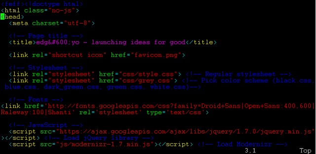
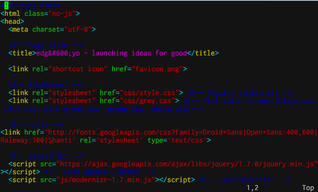
Here: have a gander at the before and after

Before - Courier size 10, background: #000000;

After - Inconsolata size 12, background: #191919;
I still have yet to tweak the ANSI colour settings for my PuTTY though – I’ll get to it sooner or later – when my eyes hurt again. So, what are the colour schemes that fit you best?