Earlier, I had read a great productivity trick – that is to say, start everyday as a producer, not a consumer of content. While it is not before 8 am, nor have I just got up, I’m stuck in a productivity rut right now, and I shall attempt to “restart” my day with 500 words (or so, since I can be rather lengthy). I shall also try to do this everyday (not necessarily on my blog). I’m going to choose a type of content, and talk about it on my blog. Today’s topic is varied – it will be derived from a few photos I found on my phone — think of it as a photo essay of what I found interesting and took picture of.
The Jaggies in the Kindle

I took this picture while reading on the train. It’s a picture of the rendering of text and mathematical formula in a Kindle. Do note that the fonts are rendered pretty much perfectly, whereas the formula is rendered with lots of jaggies in it (in particular, notice the small n). I’m not sure if the Kindle uses [latex]\LaTeX[/latex] to render mathematical formula (or indeed typeset the books), but I’m think this is an are of improvement the Kindle could do with.
I read quite a bit of my academic papers on the Kindle now (as opposed to 1.5 years ago, when I printed out every single academic paper I wanted to read on my ride home), and jaggies irritate me. A number of papers I read have math formulas in them – I wish Amazon would improve the formula rendering capability of the Kindle (better PDF support wouldn’t hurt either).
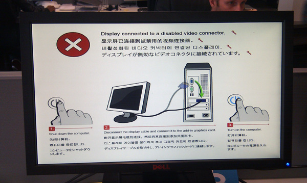
Good UX — Good instructions from a Dell monitor

When the word ‘UX’ is uttered, people most often think of computer programs, and their design of the user experience. But in my opinion UX extends to more than just software. All things that can be used should have their corresponding UX designs.
A very common UX pattern is the ‘Blank Slate’ pattern — essentially the experience a user faces when nothing has been set up yet. The Dell monitor above provides a good UX, because it instructs users to properly set up their monitors. Most monitors have a “NO SIGNAL” message instead of telling users how to set up the monitor. This one provides instructions, and I think it is a step up from a meaningless “NO SIGNAL” message.
The Power User UX Dilemma
Here, I’d like to address a common UX problem that I’ve run into more times than I care to count. I call it the power-user dilemma. And one of the best ways to look at this is the reporting of error messages. Let’s use the common kernel panic as an example. MacOS X has a very very user-friendly kernel panic message, Windows is famous for its Blue Screen of Death – which contains both an instructional message as well as an error code, and Linux has its own version of BSOD* I’ve never actually faced a Linux kernel panic before , which mainly consists of the error codes and in Ubuntu, a stack trace.
Here we can see a continuum of user-friendliness that works on two different levels. Let’s first define the users — let’s assume that there are two groups of users – the home users who uses their computers to get on Facebook; and the power users, who I will define as experts at fixing OS problems. For the home user, the MacOS X kernel panic message is most useful, because it instructs them to Stay Calm and Carry On, but the Ubuntu stack trace will send them into a panic. For the power users, the Ubuntu stack trace that accompanies the kernel panic message is most useful, because they can use the error codes to fix their problems, while the MacOS X message wouldn’t help them at all* yes I am aware of logs because it contains no details on what caused the crash.
The question is of course: Who do you design for? Do you design for the home user (and end up with MacOS X)? Do you design for the experts (and end up with Linux)? Or do you try to please both ends and cater to both (and end up with Windows)?