A few months ago, I blogged about my frustrations with logarithmic progressions with weightlifting. I highly enjoy linear progressions – who doesn’t enjoy work that is easy? But I was wrong about one thing: I hadn’t hit the logarithmic progression part. In fact as at the time of writing of this blog post, I am still firmly in the linear progression phase.
So what went wrong? The answer is form. I was basically squatting with exceedingly poor form. I was using all kinds of stabilizer muscles in an unbalanced way that left me injured often. I took notes and noticed that it was at around 55 to 60kg that I kept getting injured about and hence the weights I squatted lingered around there. There is an old saying goes: “Practice Makes Perfect”. That is wrong. The phrase that should really be passed around is “Perfect Practice Makes Perfect”.
The breakthrough came when I got got my partner to record me squatting for the first time. I had religiously read /r/fitness and /r/formcheck, so I had a fairly good idea of what good form is. I thought I had good form – I didn’t. One of the first things I noticed was that I wasn’t squatting anywhere near deep enough, despite the fact that I had all along thought that I was doing an ass-to-grass squat.
After years spending seated in front of the computer, I had no spatial awareness of how deep I was squatting. I had to learn what a deep squat was (learning the flexibility to do that is a tale on its own). I taught her how to check for correct form: the hip crease must go lower than the top of the kneecap to be counted as a good squat. And so she began to spot me. But this wasn’t fair for her as it was eating into her training time. So after a couple of sessions, I went about developing an app that used computer vision to determine if I was squatting with good form.
The thing about computer vision is while it’s easy to start, accuracy is a Difficult goal with a capital D. One indeed can spend a lot of effort to boost the accuracy a very miniscule amount. I cut down a lot of that by using various hacks like coloured sticker dots on the hip crease, knee and barbell tip to increase the accuracy of the app. By and large, I got it working, for me. But it wasn’t working for my partner, or a colleague who had begun to be interested about the app (he had separately approached me about the feasibility of an idea similar to SmartSpot, whose idea I love). The killing blow, I think was that I had irritated some fellow gym-goers by my wrapping of a gorillapod around their racks or bars in order to set up a static filming point.
And so it transpired I would need a new app. The app would have to do these things in order to teach me to have a better squat form:
- Monitor my form as I squat
- Inform me when I have hit a good form
- Only one person involved – no interfering with anyone else in the gym
Introducing SquatCoach
After a bit of imaginative thinking, I wrote the prototype of what is released today as SquatCoach (Android | iOS). The idea was simple – strap a device full of sensors (read: any modern phone) to the legs, and use the sensors to detect whether I had good form or not. It was kinda obvious.
At first I wrote the app for myself. The app did one thing very simple – play a sound when I had hit good depth. Gradually, the app got a bit more complex – I started tracking if my knees were caving in, and whether or not I was putting excess force on the knees (easily tracked by checking if the knees extend forwards on the downward motion).
About a week after I built my first prototype app, I showed it to a few friends. I still recall the first question one of my friends asked after I told him about the app and how I am using it to improve my form: “Can I play music while using the app?”. The more I asked around, the more it transpired that that the idea of having an app that teaches you how to squat properly was a popular one. And so I decided to commercialize the idea.
From Personal To Production
The first version of the app looked something like this (which I used for myself):
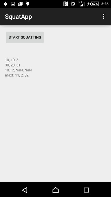
There was no UI, save for a button. I had tinkered around with a few other ways the app could work – I’m really a fan of UI-less applications. One version I had was just a background service that played a sound when the correct squat depth was reached. That wouldn’t fly. I went around asking if people would use the app, and after showing them, they’d ask, “where’s the app?”
I had to have a UI. At around the same time, I had a gym acquaintence who gave me this tip: keep your head neutral when squatting – pick a spot, and stare at it for the duration of the squat. The gym I train at has a mirror behind of the power rack, so you could watch yourself squatting. I put two and two together, and decided to add a feature to count reps as you squat. This gave the app more “meat”. Alongside that I updated the app to vibrate instead of play a sound (so people who use their phones to play music while they work out can use it without distraction).
An app that just vibrates when a good depth is reached isn’t of much value. No. The app needs to actually track good form. And so we did some research and collected data. The app collected data from day 1. I mainly used the data to plot my form. But what is good form, really? There are a few videos on the internet explaining what good form is. I personally wasn’t able to reliably replicate those good form as I had at that point in time, yet to be flexible enough, so I had to enlist outside help.
I enlisted the help of several other more experienced squatters (who all squat with perfect form), and recorded their data. I aggregated the data from the 7 people I had initially testing, and formed the “model” of what a good squat is. It is this model which the squat data are compared and scored against. The set up for the gathering of data itself was a challenge and worthy of another story, perhaps another day. Currently the model is “baked in” as 20 or so constants and a few functions. Future versions will contain a on-line machine learning system. Our team is still debating if we should have a upload data-to-server component.
The most important lesson learned from the process of gathering data was that both iOS and Android versions of the app had to be developed. I had discovered that many people were disdainful that the app would be exclusive to Android (as I am a daily Android user). So at Pressyo we serially-parallel developed both Android and iOS versions.
Designing the SquatCoach App
SquatCoach was a learning experience for us – while we had written many production quality web apps before, a production quality Android and iOS app was new for us (our experience with mobile apps had been mostly personal and internal apps, where polish wasn’t as important). We ran into a few interesting design challenges along the way.
Interaction Design
We designed this app to be as simple as possible. The idea was that you’re just supposed to strap the phone to your legs, and squat. The app is supposed to figure out the rest. This way, you can focus on performing the squat without having to worry or constantly check the app to see what is happening.
We had initially collected data on all sorts of different kinds of squats (well, 3 – back squats, front squats, and bodyweight squats). We discovered that having to specify which exercise you would be doing was involving too many steps for the user. Later on, we differentiated the back squats into high-bar and low-bar squats, which added to the user confusion.
It’s often easy to get carried away by adding features when writing programs. Over the course of iterating on this app, we went overboard with features. One feature we added was social media sharing –
Flow test 1. Quite disappointing results pic.twitter.com/y5Wx1gKjaW
— Chewxy (@chewxy) May 27, 2015
It was buggy, as it was supposed to screenshot the screen, and then crop to an appropriate size, then shared on Twitter. Granted, it was a bad idea to do it that way, and there are better ways of doing it. But a lot of time was spent dicking around with things that aren’t related to the core duties of the app: teach the users how to squat.
Some other features that we started to implement, before they were ultimately canned were cloud based storage of historical records (useful, but not really useful in the context of learning how to squat, other than to see progress) and tracking various other activities like benchpress. The project was becoming runaway.
Eventually we scaled back down and focused on the core thing: tracking squat forms. We doubled down on figuring out better algorithms for detecting good squat forms. We figured that reinforcement learning would be the best way to teach squat form. The vibration feedback when squatting was one way, but there would have to be a repeated reinforcement at the end of a set, to remind the user that he/she did well, and showed where to improve.
Score Design
The app itself tracks a lot of other things to determine if a squat form is good (limited of course, to what it is able to detect). We needed a way to display that information without cluttering the screen.
The first few ideas we had were to do with scoring. It was easy, and something we have a lot of experience doing: take a bunch of numbers, and merge them down to a singular score. But one number is not informative enough. Eventually we settled for what is in the current version of SquatCoach
The display of the score was inspired by the periodic table. The elements of the periodic table are frequently displayed as letters in a square box with numbers around them. Here’s an example of a chemical I cannot live without:

The periodic table box is a good way to show quite a bit of information in a small area without having to resort to a table. It’s information visualization by convention. By convention, every periodic table box would have the element symbol, the atomic mass and atomic number listed.
The beauty of the periodic table box is that depending on advancedness, you get more information per box. I’ve seen periodic tables where the valence shell numbers are shown, while some other periodic tables might have first ionization energies listed.
The downside to a visualization like this is while it can pack quite a bit of information in a small space, it’s also quite contextless if you don’t know what they numbers stand for, and hence a learning curve is required. This will be addressed in upcoming versions of the app.
We debated using the Wilks Score instead of weight ratio, but that required us asking for more information about the user than what our test group said they were comfortable giving up – namely their gender. It also interfered with our idea that it should ask for as little information from the user as possible (both from a privacy perspective and from a usability perspective).
Forms
By design, SquatCoach is exceedingly simple to use. However, in order to calculate the score, we had to have some information from the user that we wouldn’t have had prior: the weight the user was squatting and the user’s body weight. This required a form for data entry – this is simple on a web page, but an app has a lot more subtleties:
- Do we put everything in a table?
- Do we restrict input?
- If we do, how is input entered? On a keypad? On a multi-part selector?
- Can the field be seen once the onscreen keyboard pops up?
On iOS, restricting the keyboard to the decimal one came with its own interesting problem – the decimal keyboard does not have a dismiss or done button. Yep, that done button we’ve grown so accustomed to seeing is actually a customisation – not default. It made sense now why a lot of applications didn’t update to resize to the iPhone 6 and 6 Plus sizes. We chose the simplest solution – instead of having a fixed Done button above the keyboard, we had it dismiss when you tapped anywhere except the keyboard.
On Android, we didn’t have the above problems, however, after a few attempts at trying have a uniform interface between both platforms, we decided that it would be wisest to follow each platform’s conventions. The result was that the user interface for each platform is slightly different. I will have to say though, the iOS form does indeed look better than the Android version. Upcoming versions aim to fix that.
For example, in the Android version, there is a big visible button to start and stop squats. This was a problem for the iOS version as buttons on iOS are small! In iOS 7 onwards, they only encompass the words on screen, unless you customise it. We grappled with this for while, since we didn’t want to have gigantic text just to have a larger touch target. In the end we chose to make the button a little larger on Weight screen; and we allowed the entire screen to press the button for us on the Squats screen. (After all, that’s when you want to be fumbling less with your phone.)
Interesting Things Learned
We had an iPhone 6 Plus user, so we were very keen on ensuring that our app scaled to all sizes. Storyboards have proven to be an amazing tool for ensuring everything was in the intended place. There is a slight learning curve – like realising that constraints weren’t automatically added for you, so we had some amusing moments trying to figure out why elements decided it belonged in on iPad-sized screen while running on an iPhone 5S.
A slightly interesting thing that we learned was that managing the parallel development of two app on different was easier than expected. It was also a lot more serial and linear than expected. Often, a feature would be developed on one platform first, and then the work would have to slow down until the other platform catches up to feature parity before we would continue.
Perhaps the most interesting thing about this exercise, is that I couldn’t find any app on either app stores that did what I wanted – an app that teaches you how to squat. The apps that are out there are variations of workout tracking. I seriously wonder why. This could either mean that this is such a terrible idea that this project is going to fail, or this is new ground that is being explored, opening a path for people to copy.
Another interesting thing that we learned was that app store deployments took a lot more paperwork than we expected. And way many more questionaires than ever imagined.
Lastly, I was quite amused to find out how hacker-y my test group was. A good number of people in the test group couldn’t wear a phone band around their thighs (they were too developed), so they put the phones in their shorts (and the app still worked!). One guy even extended an existing arm band to make it longer (though to be fair, he is quite handy with a sewing machine, being a cosplay veteran) so that his thigh could fit. This also led to us focusing more on making the app work when the phone is in the pocket. Upcoming versions aim to fix a few issues on that end.
The experience of writing this app has been an interesting one. While we’ve written apps before, we’ve never written one that was meant to be out in an app store. For that, my experience has been to cut, cut and cut. Most features aren’t necessary, and I felt that we wasted a lot of time trying to add features that weren’t necessary. On the other hand, I’m quite glad for just launching the app. I think you should check it out.